

I am NOT an interior decorator by any means (and neither is my husband). I mean, if you've seen my house, that's pretty obvious. We kind of just order whatever furniture or paint colors we like for each room without any other thoughts or considerations. We definitely picked our own bedroom paint color and then coordinated the bedding to match that. I foresee many cringes as that sentence is read but it's true! We're hopeless. My cats leaving their hair all over the place is the only constant in our house. None of our rooms really have decorative themes. That just meant added pressure when putting together Ethan's nursery!
We picked out the furniture and bedding set no problem. We're doing an "under the sea" themed nursery.

Thanks mom and dad! What fantastic grandparents they are!
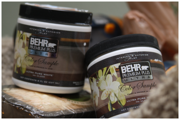
Yesterday morning my husband suggested we go to Home Depot to select paint samples and see what would look best in his nursery so we can start painting since the furniture will be here before we know it. Toting along a window valance with us for reference, we narrowed it down to two choices. One is just a tad bit darker than the bedding and the other is just a tad bit lighter. All we really knew is we didn't want the very same shade of blue to drown out the bedding entirely...but we also didn't want the blues to clash. We spent an embarrassing amount of time in the paint aisle. Other customers probably picked out paints for their entire house while we sat there doting over blues for one tiny little nursery.
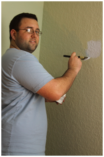
Then it was go-time. The cats and I watched intently as Aaron painted little patches on the walls with the sample paint. I tried to be patient as the first coat dried and he applied a second. Then I tried to be patient and go to sleep so I could see how it looked in the morning when it was dry and the sun was shining into the room. (We won't mention the fact that I woke up to a dreary, gray day. Of course.)


This morning before my husband left for work we stood in the nursery and stared at the colors on the wall. I held up the window valance against them and we grew even more perplexed. Finally we both concluded we needed a second opinion. (We both knew this meant I'd blog about it.)
So this poses the question: #1 or #2?! WHICH SHADE OF BLUE?!

I think I like #1 better but I'm not sure if it's too dark. I'm going to be crossing my fingers all day that the sky opens and the sun comes out and shines light into the room so I can get a better idea without the assistance of a lamp or a camera flash.
What are your thoughts? #1? #2?


I like #1 a lot better, it's much more "under the sea" for me! Squee I can't wait to see it finished!
ReplyDeleteI'm thinking I like #1 better too!
ReplyDeleteI was actually thinking #2, haha. But I am not good at this stuff.
ReplyDelete#2 You'll be surprised how dark the color is when you paint the entire room. We picked out a light light shade of blue for our little guys nursery and we were both scared that it was white with just a hint of blue when I first started painting. Once the entire room was painted and two coats were applied we LOVED IT.
ReplyDeleteI love color #1, but I agree that it will look much darker when you paint the whole room. We made that mistake with a very similar color in Logan's room - and his only goes 3/4 of the way up the wall. A light shade will make the bedding set pop more :o)
ReplyDeleteCan't wait to see his completed nursery!!!!!
I like number 1 better... I think it's the same color as the little bathroom by dad's office. You might want to bring it over here and see. that may give you a better idea.
ReplyDeleteI like #1 better! Ahhhh... can't wait to see what Ethan's finished nursery looks like! :)
ReplyDelete#2!
ReplyDeleteI vote for #2.Can't tell you how many times , over the years, I wish I had gone with a lighter shade than the one I chose. Have you thought about maybe doing 1 wall in the darker blue, maybe the one the crib is going to go on. Then the lighter one on the other walls, as a contrast. No matter what you decide, the room is going to be PERFECT:)
ReplyDeleteI like #1. It looks more ocean-y. :)
ReplyDeleteI would choose #2 only because what all the others said, #1 might look too dark once the whole room is painted.
ReplyDeleteI'm partial to #1 as well, but I'm really into deep colors!
ReplyDeleteشركة نقل اثاث بالجبيل
ReplyDeleteشركة نقل عفش بالخبر
شركة نقل عفش بالقطيف
شركة نقل اثاث بالاحساء
شركة نقل عفش الجبيل
شركة نقل عفش بالدمام